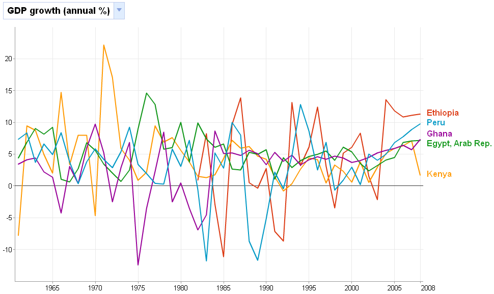
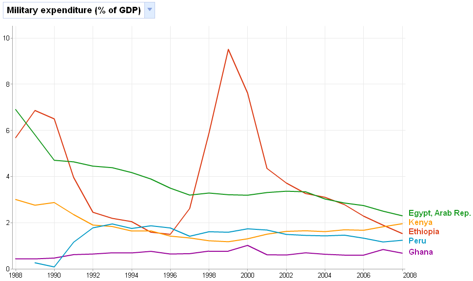
Ethiopia's trends compared with some selected countries
The graphs below are made using Google's public data explorer. What's neat about this tool is that it allows you to quickly visualize data and spot trends. I wanted to see how Ethiopia's trends compared with some selected countries. The results speak for themselves, but I think you should take them with a grain of salt since the data comes from the World Bank which, in turn, gets a lot of its data directly from member countries.


No comments:
Post a Comment